Product Design (Web)
Navigation for the Acquisitions Experience
A fast lane for high-intent customers that scaled into an acquisitions-wide wayfinding layer.
- Role
- Lead Designer
- Client
- American Express
- Duration
- 12 weeks
- Deliverables
- Site Area Navigation
American Express recognised the need for a dedicated sub-navigation for the acquisitions experience, as the global navigation did not fully meet the needs of prospective customers.
It started as a sub-nav on the Product Hub — a fast lane for high-intent users that didn't disrupt the evaluator experience. As the design evolved, we saw its value across the whole pre-application journey and expanded it into a scalable, acquisitions-wide pattern.
The navigation is part of a larger cross-functional business initiative to deliver a more cohesive, high-performing customer journey across American Express's digital experience.
01The challenge
The Hub was designed for evaluators — but intent isn't static. Some customers already knew what they wanted and just needed a faster path to get there.
- ✦High-intent customers arrive with a clear goal and low tolerance for friction.
- ✦They come via direct or targeted channels and head straight for product pages or an apply button.
- ✦Goal: grow applications and start rates by reducing friction across the pre-application journey.
The high-intent customer doesn't need to be sold to — they need to be guided efficiently. They spend little time on exploratory content, move quickly between pages, and show strong readiness signals, like heading straight to a product details page.
Business objectives: increase revenue through better product discoverability and conversion, grow new card applications, and improve start rates with more intent-driven experiences.
Two design principles guided the work: speed and directness, and an acquisition focus — every destination was evaluated by how well it advances the path to application.
02The process
- 01
Site map audit
Audited every page relevant to the customer journey. The first proposal included non-acquisition pages such as benefits pages, but we reconsidered:
- ✦Risk of journey disruption — those pages have no consistent CTA back into acquisition
- ✦Loss of continuity — drop-off points the team can't control or optimise
- ✦Self-sufficiency — the Hub itself should surface everything a customer needs
- 02
Round 1 — low-fidelity test
Tested core concepts early. The hypothesis was confirmed: the sub-nav meets the high-intent need to move quickly.

- 03
Rounds 2 & 3 — high-fidelity tests
Sharpened interactions and visual hierarchy. Round 2 showed users were unclear where links led and the bar blended into the page, so we added colour, shadow and clearer labels. Round 3 added icons and a hue associated with interactivity.

- 04
Mobile iterations
With no proven enterprise pattern to benchmark, I started from the live US hamburger menu. Solutions A and B hit tech constraints, so Round 3 tested a kebab menu — but hamburger plus kebab on mobile confused users. I went back to discovery and ran a comparative analysis of card providers and other brands, which pointed to a drop-down menu.

- 05
Card sorting
We still lacked clarity on which pages to include, so our UX Research team ran a card sort across category pages, product detail pages and card search and recommendation tools — giving us an evidence-based information architecture.
- ✦A list of card categories with a clearly visible “View All Cards”
- ✦Prominent access to Compare Cards and Help Me Choose
- ✦Individual PDPs and external pages deferred to future iterations
Most common grouping of cards and categories by users

03Key decisions
Scope
Insight
Linking to non-acquisition pages risked losing customers mid-journey with no route back.
Decision →
Scope the navigation exclusively to pages owned by the acquisitions team.
Visibility
Insight
The bar wasn't prominent enough — its colour was too close to the page background.
Decision →
Make the bar stand out with colour, shadow and icons.
Labels
Insight
Users were unclear where the links led.
Decision →
Replace ‘View All Cards’ with clearer ‘Explore All Cards’ and ‘Cards By Category’.
Mobile
Insight
A hamburger inside the hero would complicate the build and scale poorly across markets.
Decision →
Test the US kebab menu, then move to a drop-down after it caused confusion alongside the hamburger.
Mobile label
Insight
In testing, “Menu” with a kebab icon felt too vague — participants weren't sure what it would reveal.
Decision →
With Content Design, label the drop-down “Find My Card”.
Sticky and focused
Insight
High-intent customers need key options at any point in their journey.
Decision →
Make the navigation sticky on mobile and desktop, and hide the global iNav on the Hub to keep focus.
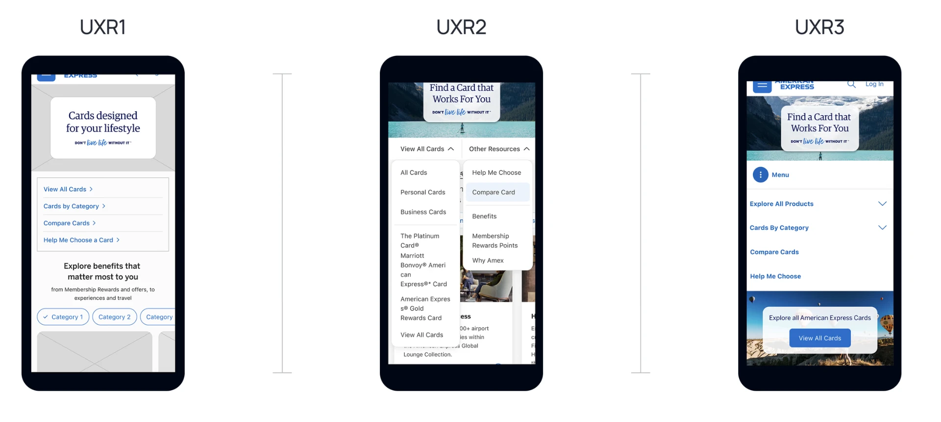
04Design Evolution
UXR1 — Low-fidelity links list
Insight
We tested core concepts early on the Product Hub. The sub-navigation proved one of the biggest areas of opportunity — high-intent users want to move quickly to where they want to go.
Decision →
Keep a simple list of entry points — View All Cards, Cards by Category, Compare Cards and Help Me Choose — and refine it in high fidelity.
UXR2 — Two drop-downs
Insight
Users were unclear where the links led, and the bar blended in — its colour was too similar to the page background.
Decision →
Make the bar more prominent with colour and shadow, and replace ‘View All Cards’ with ‘Explore All Cards’ and ‘Cards By Category’.
UXR3 — Kebab menu
Insight
Hamburger-in-hero solutions hit tech constraints and wouldn't scale across markets, so we tested the US kebab menu. Desktop performed well, but a hamburger plus a kebab on mobile caused confusion.
Decision →
Revisit discovery with a comparative analysis of card providers and other brands, which pointed to a drop-down mobile navigation in the final design.
05The outcome
From a Hub feature to an acquisitions-wide navigation pattern.
- A persistent wayfinding layer across product listing, product detail and compare pages.
- Faster paths to application for high-intent customers without disrupting evaluators.
- An evidence-based structure from card sorting: categories, View All Cards, Compare Cards and Help Me Choose.
Next steps
Reflection
The original vision was to adapt the global site navigation, but iNav is market-agnostic, owned by another team and has limited flexibility for rapid change — so we built a dedicated solution for MVP1. For MVP2, it's time to collaborate with the iNav team on longer-term alignment.
Next case study
The Page Assembly Model — Scaling at Amex →