Product Design (Web)
The Page Assembly Model — Scaling at Amex
Market-agnostic templates and governance that bring the international Card Shop into one scalable design system.
- Role
- Lead Designer
- Client
- American Express
- Duration
- 4 weeks
- Deliverables
- Core Design Templates
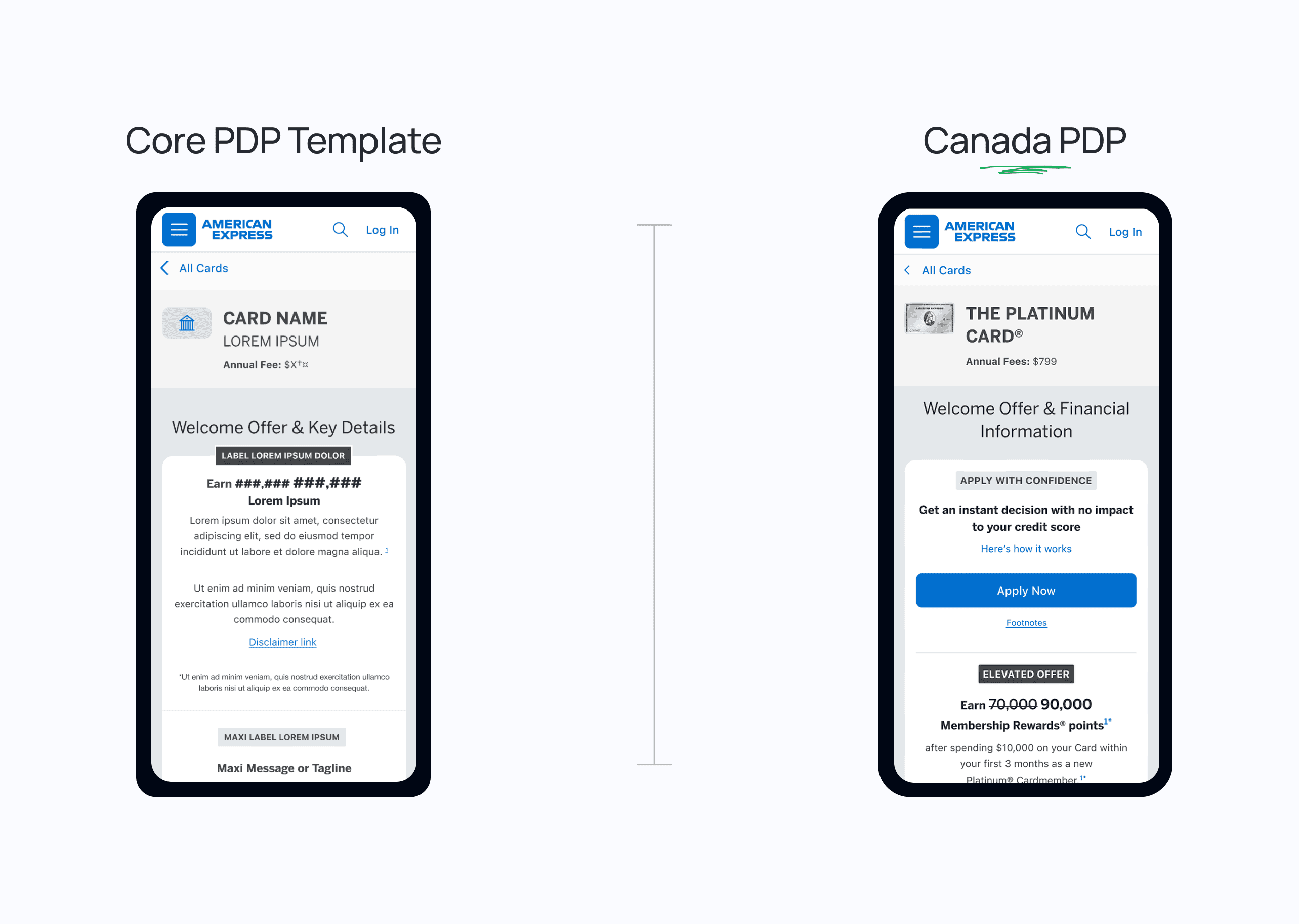
The Page Assembly Model is the core strategy underpinning the end-to-end design system uplift planned for 2026, bringing our core digital experiences into the new design system.
It brings our assets into the new design system through three approaches: a systems style uplift that keeps the existing structure of Compare and Product Listing pages; a refreshed Product Details Page; and an entirely new Product Hub designed in the new system.
Each template acts as a parent wireframe that can be configured and reused across markets — a shared foundation that still allows for local requirements across our five priority markets.
Ultimately, it provides a repeatable framework for a more consistent user experience, a stronger technical foundation, faster content operations and a more efficient path to scaling.
01The challenge
The international Card Shop had evolved differently across markets, creating multiple variations of similar components, layouts, navigation patterns and page structures.
- ✦Inconsistent customer experiences across markets.
- ✦Duplicated design and development effort, rising maintenance costs and technical debt.
- ✦Slower feature rollout, more complex QA, and limited scalability into new markets.
Many of these differences addressed genuine local requirements, but together they introduced unnecessary complexity into the wider ecosystem.
We saw an opportunity to simplify it with a shared design foundation that could support multiple markets without completely separate implementations.
02The process
- 01
Design audits across markets
Reviewed existing Shop experiences to identify duplicated components and unnecessary variations.

- 02
A component governance model
To support consistency without restricting innovation, we categorised components by flexibility — clarifying what could change, what should stay consistent, and when exceptions are appropriate.
- ✦Core — fixed elements like navigation, application headers and key form fields; only content is localised
- ✦Configurable — predefined options like benefit tiles, filters, in-page navigation and welcome offers
- ✦Customisable — flexible areas like heroes and campaign zones, needing more care to maintain

- 03
Five global base templates
Defined Shop Hub, Product Listing, Advanced and Standard Product Details, and Compare Cards using shared libraries AQX and DS7.

- 04
Organising around customer intent
Rather than treating each page as an independent destination, we mapped them to customer needs. Shop Hub supports early exploration and builds confidence; Product Listing helps evaluate options; Compare Cards enables side-by-side evaluation; Product Details give what's needed to decide confidently. Intent overlaps, so users can move between them freely.

- 05
Piloting with the Canada PDP
Instead of a separate design per market, the core template set structure, layout and interactions; the local team configured products, content, offers and compliance — reducing duplicated effort while keeping the journey consistent.

03Key decisions
Shared foundation
Insight
Market differences solved local needs but added unnecessary complexity to the ecosystem.
Decision →
Introduce market-agnostic base templates covering the whole acquisition journey.
Consistency vs flexibility
Insight
Teams needed to know what could change and what must stay the same.
Decision →
Split every page into mandatory core sections and configurable sections, with documented rules.
Intent over destinations
Insight
Users move through stages of decision-making, and their intent overlaps between pages.
Decision →
Give each Shop asset a dominant purpose tied to a customer need.
Governance for adoption
Insight
Templates alone wouldn't scale without shared understanding.
Decision →
Ship component definitions, build kits, configuration rules, market expansion guidance and an exceptions process.
04The outcome
From individual market pages to a global design system for the entire Shop journey.
- Customer experience: a more consistent, intuitive journey to explore, evaluate and compare cards.
- Business efficiency: faster launches, less duplicated design and engineering, stronger brand consistency.
- Platform scalability: fewer component variations, simpler maintenance, a foundation for personalisation.
Reflection
The biggest challenge was balancing global consistency with local flexibility. Defining core templates, reusable sections, configurable components and clear governance created a framework that makes experiences easier to design, build and maintain.
My key learning: scalable experience design goes beyond reusable components. It's about a shared understanding of how the whole journey should work, where consistency matters, and where flexibility adds value.
It also reinforced considering decisions at both the customer and platform level, so UX improvements can be supported sustainably across markets.
Next case study
The Product Hub →